Pan Am Path
Overview
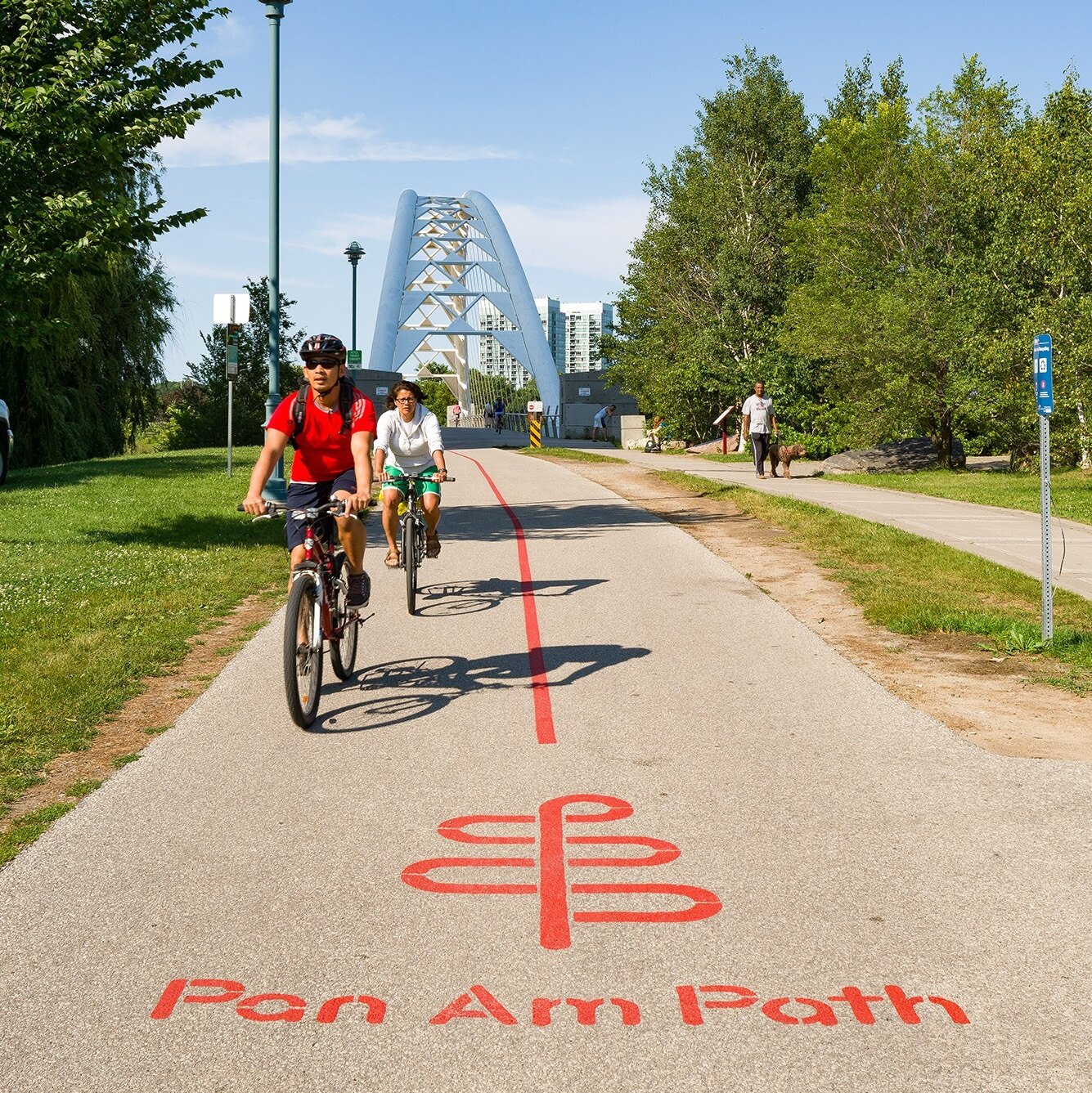
The Pan Am Path brand brings a contemporary look to 80km of linked bike and walking paths for this art-infused legacy project of the Toronto 2015 Pan Am/Parapan Am Games.
Details
- Client
- City of Toronto, Pan Am/Parapan Am
- Project
- Pan Am Path
- Size
- 262,467 sq. ft.
- Scope
- Retail & Branding Experience, Wayfinding & Donor Recognition
- Location
- Toronto, ON, CA
- Year Completed
- 2015
The
Goal
To bring the Pan Am Path to life, the City of Toronto asked R&P to develop a brand vision to represent this new 80 km crosstown trail and provide a coherent and consistent visual identity within the larger context of the City’s existing and new network of trails. The vision: a trail across the City linking Toronto’s diverse neighborhoods and communities, with opportunities for sport and recreation, art and culture, enriched public spaces, and tourism and commerce. The design raises awareness of the Path leading up to the Games and leaves a timeless visual application for years to come. The new brand vision includes strategies for implementation that the City could explore in both marketing and wayfinding during and after the 2015 Games.

The
Design
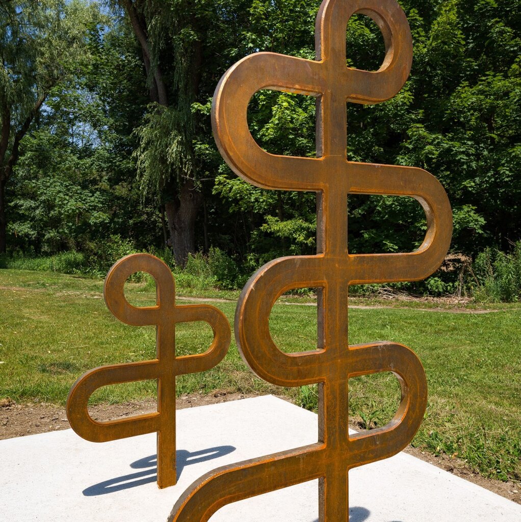
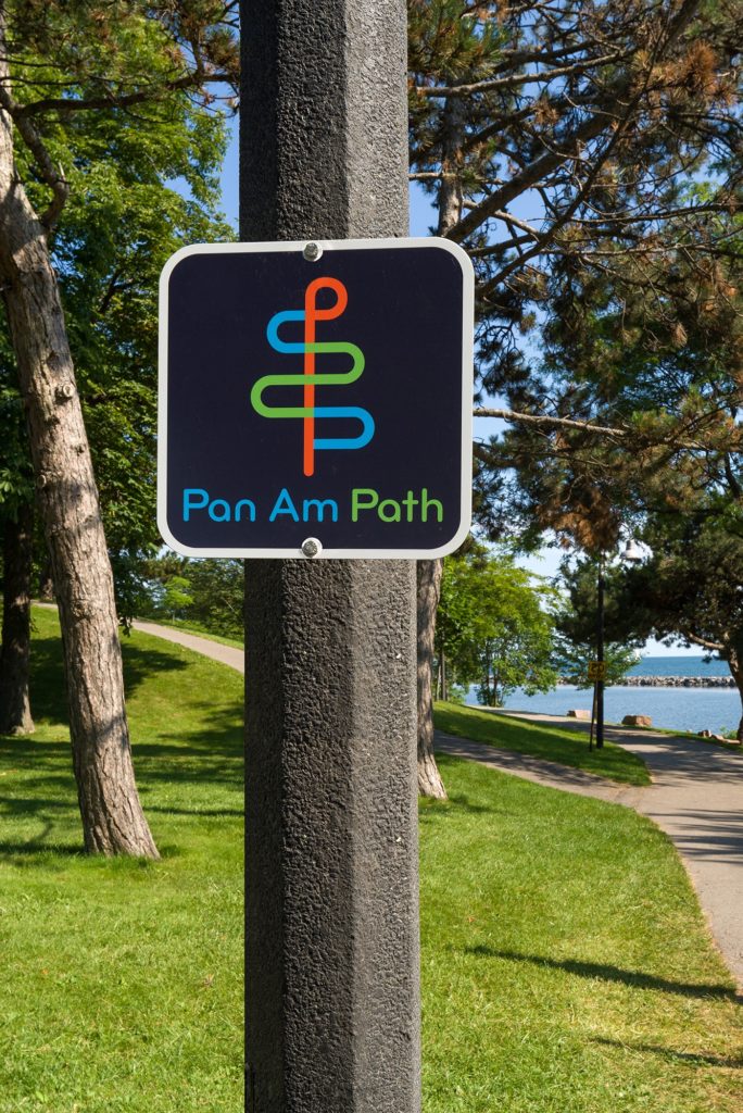
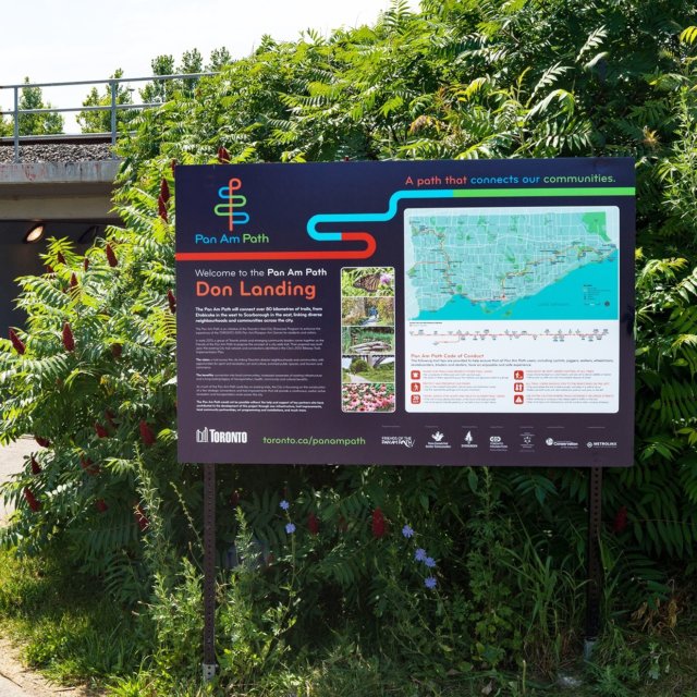
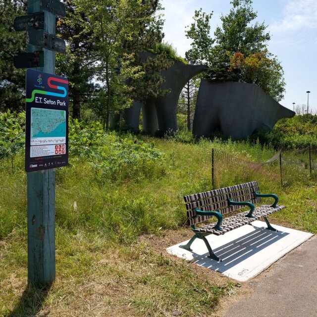
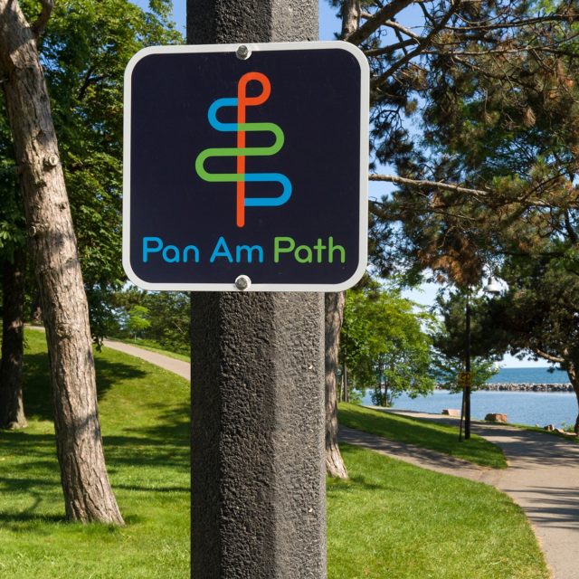
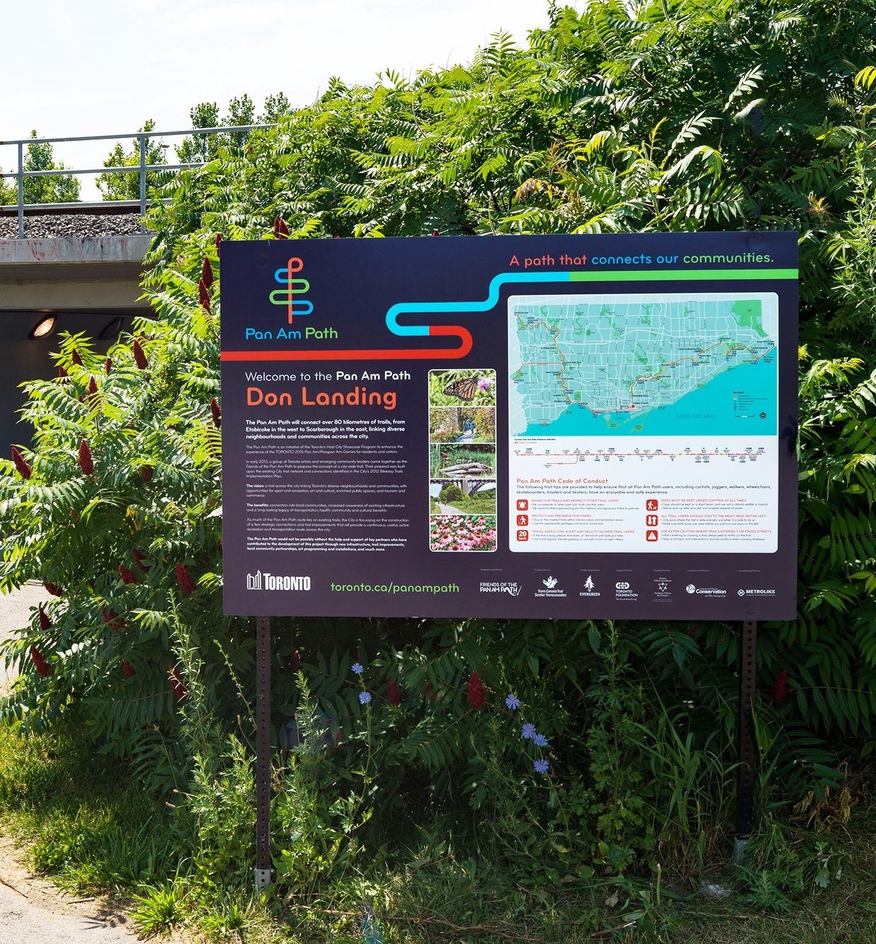
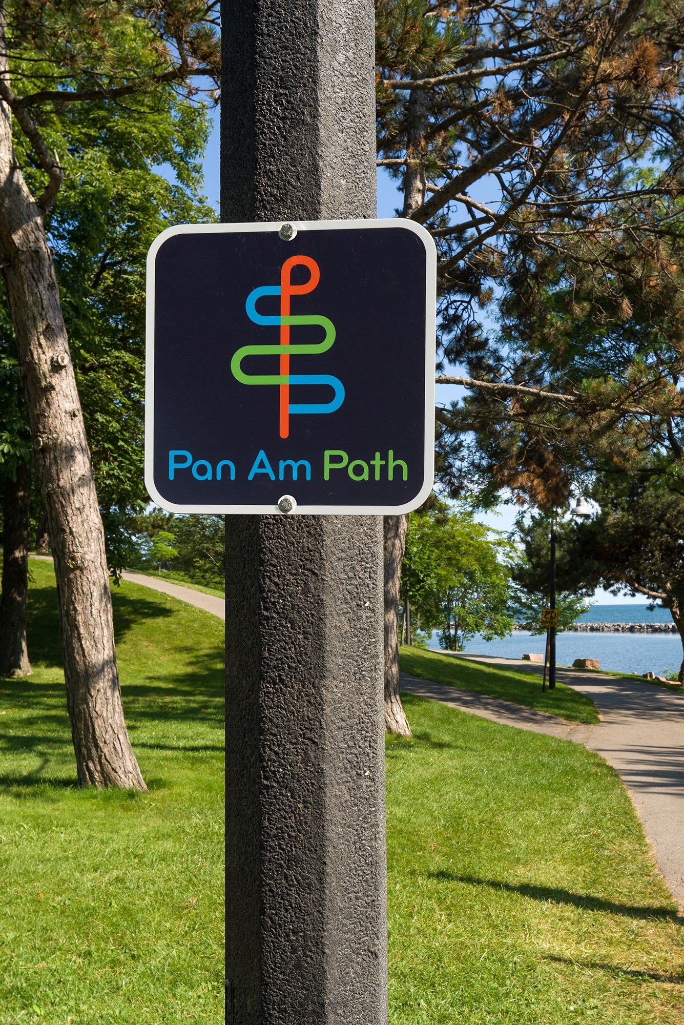
R&P was inspired by the connections created by the path between people and the nature found in their community. To represent the theme of connections between the various existing trails and the diverse neighborhoods along the Path, R&P used the letter ‘P’ (for both ‘Pan Am’ and ‘Path’) in different colors repeated vertically to form a symbol that resembles a stylized tree for the visual identity of the brand. Each connection represents a different portion of the Path and its community. Since the Pan Am Path was a supplement to the existing Pan Am Games event, it used a matching color palette and typeface to link it to the parent brand.
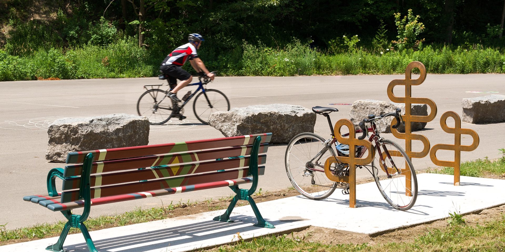
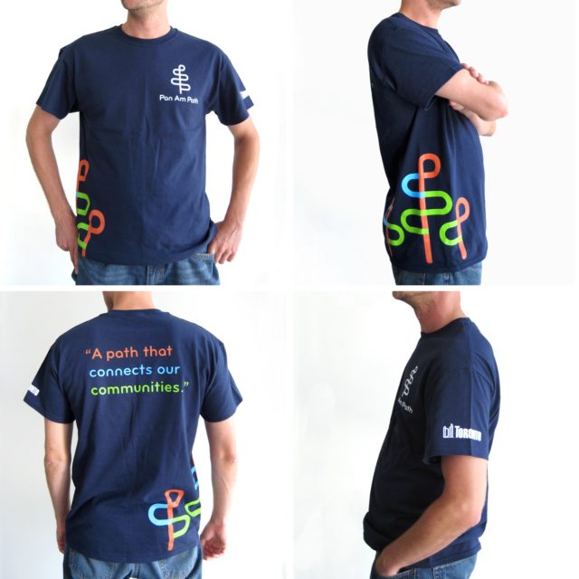
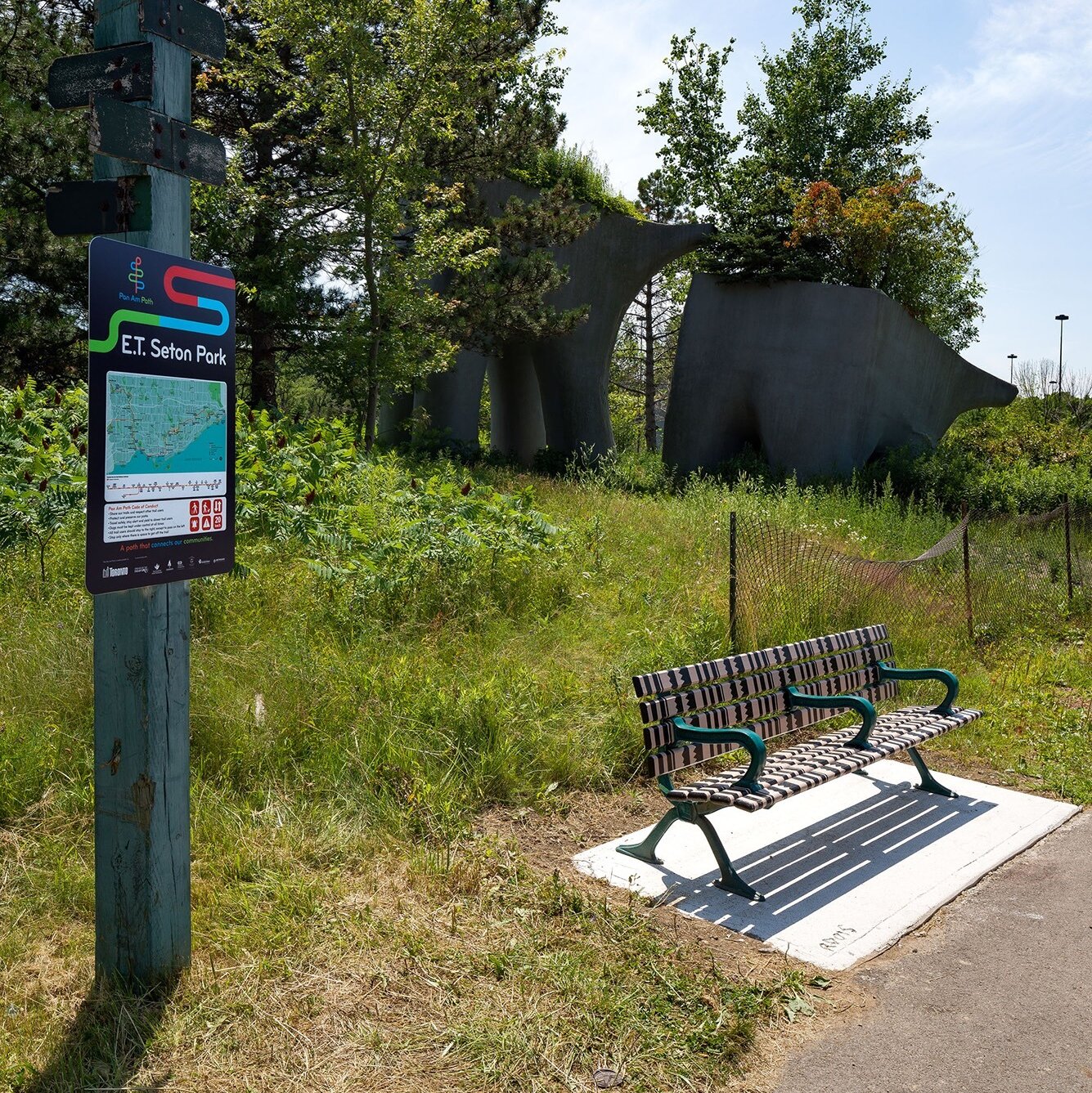
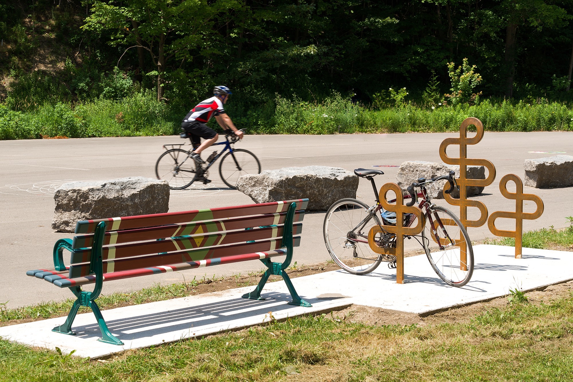
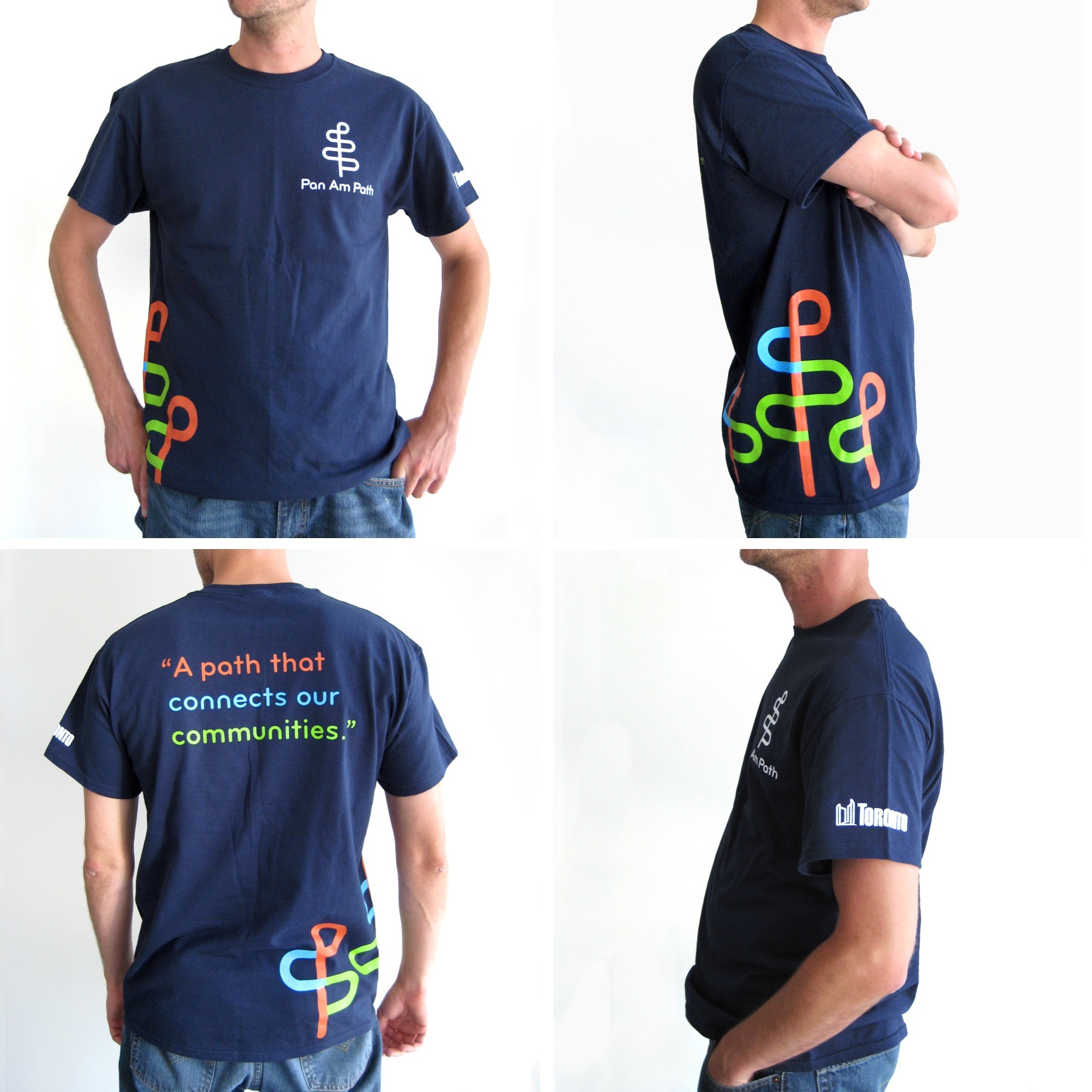
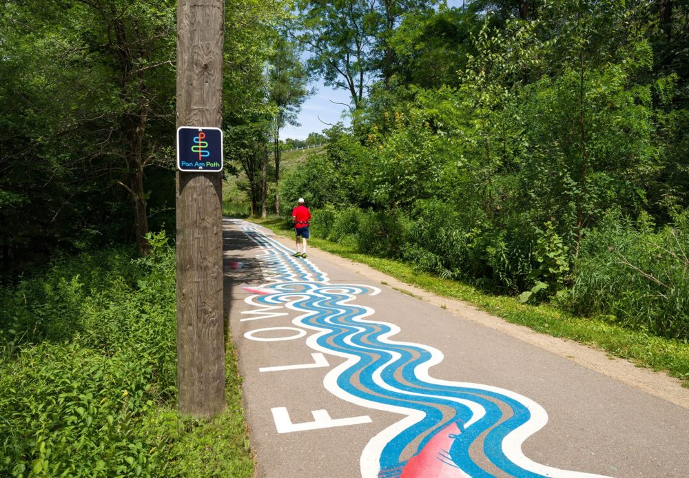
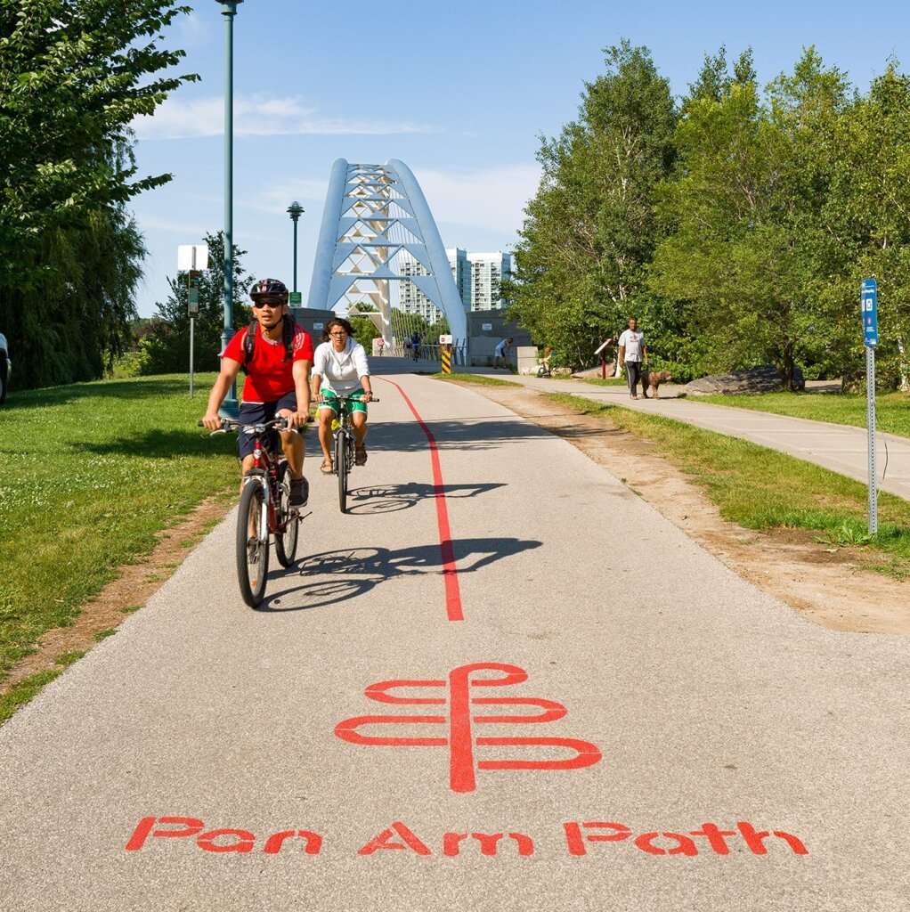
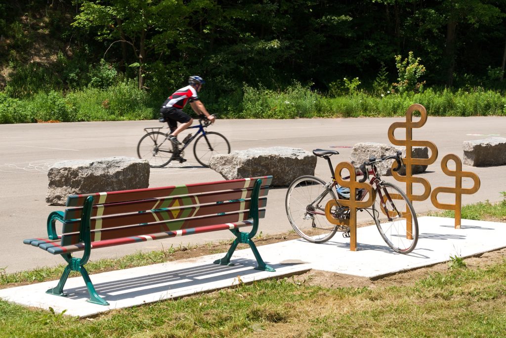
The brand is vibrant, colorful and stands out among the myriad of city signage that is found along the Path. The brand guidelines suggested iconic ways of reinforcing the logo, such as in the Path’s custom bike racks. The document outlined the brand values, best practices for the use of the new Pan Am Path identity, provided complementary brand graphic motifs and patterns, and an extensive application sections for brand implementation to printed brochures, clothing, banners, floor graphics, bike racks, wall murals, web/mobile sites, and social media.
The
Results
The Pan Am Path is a resounding success. The Path has become an important part of the city fabric and the look and feel of its signage gives a contemporary voice to the City that meshes well with the art-focused events that are regularly held along its length.
Many of the graphic motifs and application techniques described in the manual were implemented, such as the floor graphics, bike racks, and t-shirts, and the new wayfinding sign designs followed the branding specifications directly, which speaks to the success of the brand guidelines and the strength of the identity.